

7 Stunning Yarn Color Combinations You Must Try
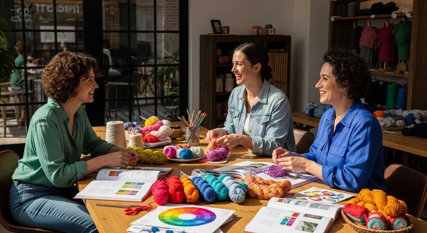
Yarn color choices can completely change the look and feel of any project. You might think picking colors is just about matching your favorite shades, but color theory actually plays a major role. Studies show that harmonious color combinations can boost the visual appeal of a design by over 60 percent. So, the most eye-catching craft pieces usually start with a lot more strategy than first meets the eye.
Table of Contents
- Understanding The Color Wheel Basics
- Choosing Complementary Colors For Contrast
- Using Analogous Colors For Subtle Harmony
- Creating Depth With Triadic Color Schemes
- Exploring Neutrals And Their Versatility
- Playing With Textures In Color Combination
- Tips For Testing Color Combinations In Your Projects
Quick Summary
| Takeaway | Explanation |
|---|---|
| Understand color wheel basics | Learn how primary, secondary, and tertiary colors interact for better color combinations. |
| Utilize complementary colors strategically | Use opposite colors for vibrant designs, balancing intensity for visual impact. |
| Incorporate analogous colors for harmony | Mix adjacent colors to create soothing, cohesive palettes in your projects. |
| Explore triadic schemes for vibrancy | Use three evenly spaced colors for bold yet balanced designs in crafting. |
| Test color combinations effectively | Create swatches and observe colors in different lighting to ensure your choices work well together. |
1: Understanding the Color Wheel Basics
Creating stunning yarn color combinations starts with understanding the fundamental principles of the color wheel. When selecting yarn colors for your projects, knowing how different hues interact can transform your crafting experience from ordinary to extraordinary. Learn more about color theory in crafting.
The color wheel is a visual representation of color relationships that helps crafters make informed color selection decisions. At its core, the color wheel organizes colors based on their chromatic relationships, revealing how different shades and tones can harmonize or contrast.
Key color wheel fundamentals include:
-
Primary Colors: Red, blue, and yellow are the foundational colors from which all other colors are derived
-
Secondary Colors: Created by mixing two primary colors (green, orange, purple)
-
Tertiary Colors: Formed by combining a primary and adjacent secondary color
According to the Defense Information School, understanding color relationships helps crafters create visually appealing and balanced designs. When selecting yarn colors, consider these strategic approaches:
-
Complementary colors (opposite on the color wheel) create vibrant, high-contrast combinations
-
Analogous colors (adjacent on the wheel) produce harmonious and soothing color palettes
-
Monochromatic schemes use different shades and tints of a single color for elegant, subtle designs
By mastering these color wheel principles, you can confidently select yarn colors that not only look beautiful together but also express your unique creative vision. Whether you’re creating a cozy blanket, a stylish sweater, or intricate accessories, understanding color theory will elevate your crafting skills.
2: Choosing Complementary Colors for Contrast
Complementary colors create the most striking and dynamic visual impact in yarn crafting. By strategically pairing colors located directly opposite each other on the color wheel, you can generate stunning visual tension that elevates your projects from ordinary to extraordinary. Explore advanced color pairing techniques.
Understanding how complementary colors work requires more than simply selecting opposite hues. The magic lies in balancing intensity and proportion. Each complementary pair generates a powerful visual vibration that catches the eye and creates depth in your design.
Classic complementary color pairs include:
- Red and green
- Blue and orange
- Purple and yellow
According to the Interaction Design Foundation, complementary colors work best when you carefully manage their proportions. Too much of each color can create visual fatigue, while a thoughtful balance produces remarkable results.
When working with complementary yarn colors, consider these strategic approaches:
-
Use one color as a dominant shade and the other as an accent
-
Vary the saturation levels to create nuanced visual interest
-
Incorporate neutral tones to soften the contrast
For example, a deep royal blue paired with a warm burnt orange can create a sophisticated palette that feels both bold and harmonious. Soft mint green alongside a muted dusty rose offers a more subdued yet equally compelling combination.
Experimentation is key. The most memorable yarn projects often emerge from unexpected color pairings that challenge traditional color theory. Trust your creative instincts while understanding the fundamental principles of complementary color selection.
3: Using Analogous Colors for Subtle Harmony
Analogous colors represent a sophisticated approach to yarn color selection that creates visually pleasing and harmonious designs. These color combinations involve three consecutive colors located adjacent to each other on the color wheel, offering crafters an elegant method to develop nuanced and cohesive projects. Explore seamless color blending techniques.
Research from the University of California, Berkeley suggests that harmonious color combinations significantly impact aesthetic perception, with people naturally drawn to color schemes that feel unified and balanced.
Typical analogous color groups include:
-
Blue, blue-green, and green
-
Red, red-orange, and orange
-
Yellow, yellow-green, and green
When selecting analogous yarn colors, consider these strategic principles:
-
Choose one dominant color as your primary shade
-
Use the adjacent colors as complementary accents
-
Vary the saturation and brightness to add visual depth
Subtle variations within an analogous palette can transform a simple project into a sophisticated piece of fiber art. For instance, combining soft sage green, muted olive, and gentle seafoam creates a tranquil, nature-inspired color story that feels both intentional and organic.
Crafters can leverage analogous colors to create gradient effects, where each shade seamlessly transitions into the next. This technique works particularly well in projects like shawls, blankets, and sweaters, where color progression can add remarkable visual interest without introducing jarring contrasts.
Remember that context and personal preference play crucial roles in color selection. While color theory provides excellent guidelines, your unique artistic vision ultimately determines the most compelling yarn color combinations.
4: Creating Depth with Triadic Color Schemes
Triadic color schemes represent a powerful and dynamic approach to yarn color selection that can transform your crafting projects from ordinary to extraordinary. These sophisticated color combinations involve three colors equally spaced around the color wheel, creating a vibrant and balanced palette that offers maximum visual intrigue. Discover advanced color mixing techniques.
According to the Interaction Design Foundation, triadic color schemes provide an opportunity to create bold, energetic designs while maintaining a sense of chromatic harmony.
Classic triadic color combinations include:
-
Red, blue, and yellow (primary colors)
-
Green, orange, and purple (secondary colors)
-
Blue-green, red-orange, and yellow-purple (tertiary colors)
When implementing triadic color schemes in yarn projects, consider these strategic approaches:
-
Select one dominant color and use the other two as complementary accents
-
Adjust color saturation to create visual balance
-
Incorporate neutral tones to soften potential color intensity
The key to successful triadic color combinations lies in proportion and careful color management. One color should typically dominate, while the other two serve as supporting elements. For instance, a deep blue could anchor a project, with hints of bright orange and soft yellow creating visual movement and interest.
Triadic color schemes work exceptionally well in projects that require visual complexity, such as intricate blankets, complex sweater patterns, or decorative home accessories. By understanding how these colors interact, crafters can create stunning pieces that draw the eye and showcase their creative vision.
Remember that color selection is both a science and an art. While color theory provides guidelines, your personal aesthetic and creative intuition ultimately determine the most compelling yarn color combinations.
5: Exploring Neutrals and Their Versatility
Neutral colors are the unsung heroes of yarn crafting, offering remarkable versatility and sophistication to your projects. Far from being boring, these understated hues provide a foundational palette that can elevate complex color combinations or stand beautifully on their own. Discover subtle color blending techniques.
According to Design Education Resources, neutral color schemes are fundamental in creating timeless and adaptable design elements.
Classic neutral yarn colors include:
-
Cream and ivory
-
Taupe and greige
-
Charcoal and stone
-
Soft beige and warm gray
When incorporating neutrals into your yarn projects, consider these strategic approaches:
-
Use neutrals as a sophisticated background for vibrant accent colors
-
Create monochromatic designs using various neutral shades
-
Combine different neutral tones for subtle, elegant texture
Neutrals possess an extraordinary ability to transform with lighting and surrounding colors. A soft gray yarn might appear cool and sleek in natural daylight, while taking on a warm, inviting tone under soft evening light. This chameleon-like quality makes neutrals an incredibly dynamic choice for crafters.
For intricate projects like sweaters, shawls, or blankets, neutrals offer unparalleled versatility. They can serve as a calming backdrop for complex stitch patterns or provide a minimalist canvas that highlights exceptional craftsmanship. A cream-colored cable knit sweater, for instance, becomes a timeless piece that transcends seasonal trends.
Remember that neutrals are not about blending into the background, but about creating sophisticated, intentional design. They represent a nuanced approach to color selection that speaks to refined taste and thoughtful craftsmanship.
6: Playing with Textures in Color Combination
Texture transforms color from a visual experience into a tactile journey, elevating yarn crafting from simple color selection to a multisensory art form. By strategically combining different yarn textures, crafters can create depth, intrigue, and complexity in their projects. Explore innovative yarn texture techniques.
According to the Journal of Textile and Apparel Technology, innovative textile design explores the intricate relationship between color and texture.
Texture variations can include:
-
Smooth merino wool
-
Chunky alpaca yarn
-
Slubbed silk blends
-
Matte cotton
-
Glossy bamboo fibers
When exploring texture and color interactions, consider these strategic approaches:
-
Combine matte and glossy yarns in complementary colors
-
Use different yarn weights to create visual and tactile interest
-
Layer textures to enhance color perception
The interplay between texture and color can dramatically alter a project’s visual and emotional impact. A deep burgundy yarn might appear rich and luxurious in a smooth, silky texture, while the same color in a rustic, woolen finish could evoke a sense of rugged warmth.
For example, imagine a throw blanket combining soft heather gray alpaca yarn with sleek charcoal silk-blend sections. The varying textures create a landscape of visual and tactile experiences, where color becomes more than just a visual element.
Crafters can experiment with texture by mixing yarns with different fiber compositions, spinning techniques, and surface treatments. A project that incorporates multiple textures invites touch, encouraging viewers to not just see the colors but experience them through their fingertips.
Texture is the secret language of yarn crafting, allowing artists to communicate depth, emotion, and complexity beyond what color alone can express.
7: Tips for Testing Color Combinations in Your Projects
Color testing is an essential skill that transforms your yarn crafting from guesswork to precision. Before committing to a full project, savvy crafters develop strategic methods to preview and validate their color choices. Unlock advanced color selection techniques.
According to the Conference of Northern California Handweavers, understanding color relationships requires deliberate experimentation and observation.
Effective color testing methods include:
-
Creating small yarn swatches
-
Using color wheel reference guides
-
Photographing potential color combinations
-
Natural light comparison testing
When evaluating yarn color combinations, consider these strategic approaches:
-
Test colors in different lighting conditions
-
Observe colors next to each other for potential visual interactions
-
Document your color experiments for future reference
Lighting dramatically influences how colors appear, making it crucial to examine your yarn combinations in multiple environments. A color combination that looks stunning under warm indoor lighting might appear entirely different in natural daylight or fluorescent settings.
Practical testing techniques can include creating small sample squares, arranging yarn skeins side by side, or using digital color matching tools. Some crafters even photograph potential combinations and view them in grayscale to assess true color contrast and value.
For complex projects like sweaters or blankets, invest time in thorough color testing. A carefully selected palette can elevate your crafting from simple making to true artistic expression. Consider creating a small test piece or color mood board that allows you to visualize how different yarns will interact before beginning your main project.
Remember that color selection is both a science and an art. Trust your creative instincts while remaining open to unexpected color discoveries during your testing process.
Turn Stunning Color Combinations Into Beautiful Yarn Creations
Do you ever struggle to find yarns that truly capture the vibrant color combinations described in your favorite tutorials? You have explored the essentials of the color wheel, learned how to pair analogous and complementary hues, and now you are inspired to bring those ideas to life. But choosing the right yarns can be overwhelming, especially when you want perfect harmony, rich texture, and endless options.
.png)
Discover the full spectrum at CRAFTISS Yarn and find every shade and fiber you need to create your next masterpiece with confidence. Our curated selection makes it easy to experiment with color theory and texture, ensuring your projects will stand out. Ready to see your inspiration in action? Visit https://craftiss.com to browse our premium yarns and see how your vision can become reality. For makers who love to keep their colors organized on the go, explore our practical yarn bags. Start your color journey today and experience how the right yarn brings out the best in your creativity.
Frequently Asked Questions
What are complementary colors in yarn crafting?
Complementary colors are pairs of colors located directly opposite each other on the color wheel. When used together, they create vibrant, high-contrast combinations that make your projects pop visually.
How can I effectively test my yarn color combinations before starting a project?
To test yarn color combinations, consider creating small yarn swatches, using color wheel reference guides, and examining colors in different lighting conditions. Documenting your findings with photographs can also help visualize the results.
What is the difference between analogous and triadic color schemes?
Analogous color schemes consist of three consecutive colors that are adjacent on the color wheel, creating a harmonious look. In contrast, triadic color schemes involve three colors evenly spaced around the color wheel, providing a more dynamic and vibrant palette.
How can I incorporate neutrals into my yarn projects?
Neutrals can serve as a sophisticated background for vibrant colors or be used to create elegant monochromatic designs. They add versatility to your projects and help enhance complex patterns without overwhelming the overall design.
Recommended
- 8 Inspiring Crochet Color Combinations for Your Projects
- 16*0.7 Oz Acrylic Yarn Skeins Unique Colors
- 8 Rolls Chunky Chenille Yarn for Crocheting
- 30*0.7 Oz Acrylic Yarn Skeins Unique Colors


