

8 Inspiring Crochet Color Combinations for Your Projects
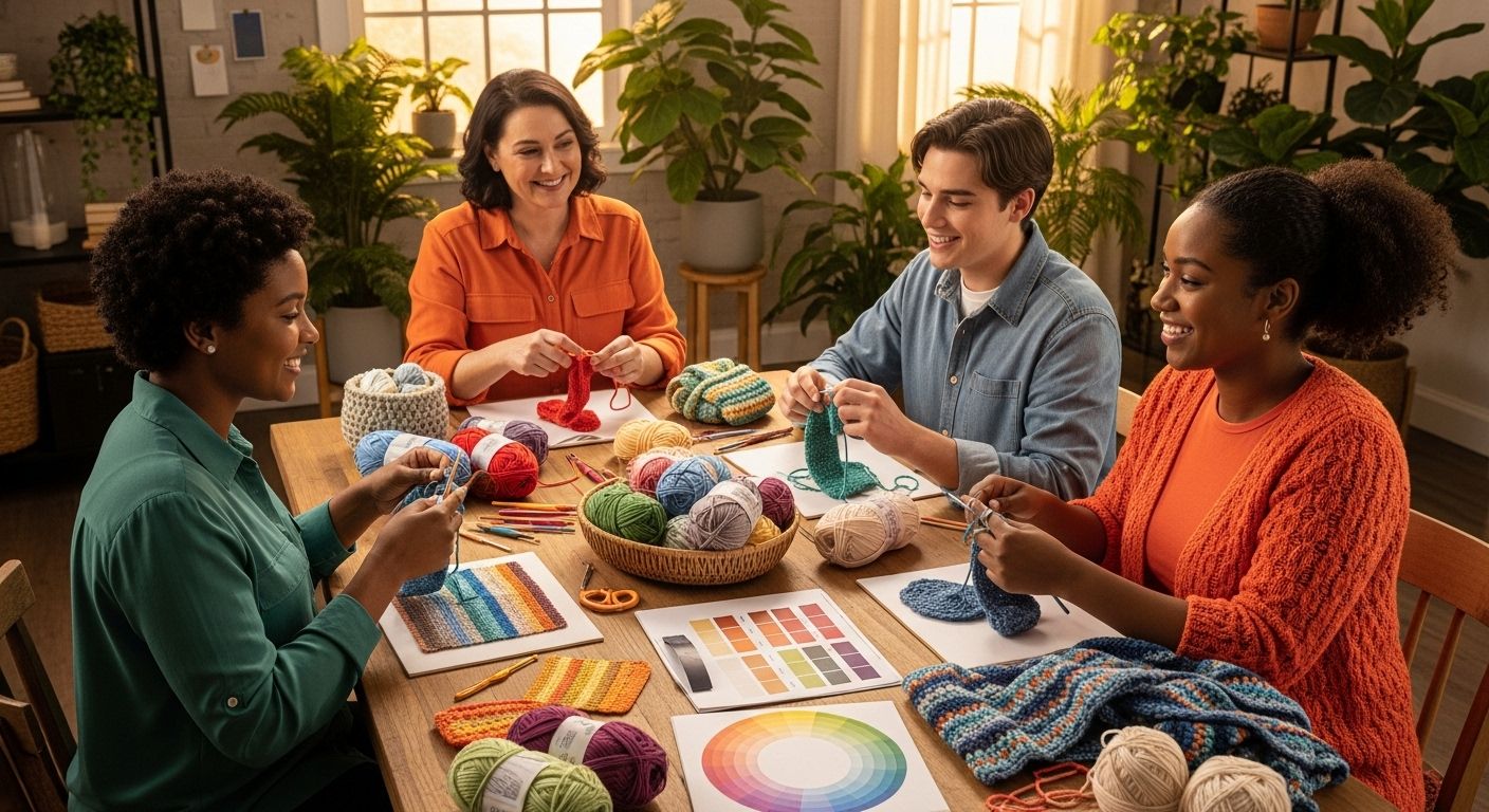
Crochet color combinations can completely shift the way your projects look and feel. Most people just grab their favorite yarns and hope for the best. But the real secret to show-stopping crochet lies in understanding that something as simple as choosing colors based on the color wheel can make your project up to 80 percent more visually appealing. With a few clever color strategies up your sleeve, you can turn even the simplest patterns into works of art.
Table of Contents
- Understand The Color Wheel Basics
- Explore Complementary Colors For Bold Looks
- Use Analogous Colors For A Harmonious Blend
- Experiment With Monochromatic Shades For Depth
- Incorporate Neutrals To Balance Bright Colors
- Consider Seasonal Color Palettes For Inspiration
- Discover Trending Color Combinations For 2025
- Tips For Testing Color Combinations In Yarn
Quick Summary
| Takeaway | Explanation |
|---|---|
| Understand the Color Wheel | Mastering the color wheel aids in creating harmonious crochet projects. It organizes colors into primary, secondary, and tertiary categories for informed choices. |
| Use Complementary Colors for Impact | Complementary colors create bold contrasts that energize designs. Employ balanced proportions to ensure one color dominates for effective visual appeal. |
| Explore Analogous Colors for Harmony | Analogous colors promote a smooth, cohesive palette. Their close relationship in tone fosters elegance and depth in your crochet projects. |
| Incorporate Neutrals for Balance | Neutrals can ground vibrant colors, providing visual relief and cohesion. Aim to use them as a backdrop for brighter hues in your work. |
| Test Color Combinations Before Committing | Testing color combinations with small swatches prevents potential design flaws. Use natural light to accurately assess yarn color interactions before starting a project. |
1: Understand the Color Wheel Basics
Crochet color combinations start with understanding the fundamental principles of color theory, particularly the color wheel. The color wheel is a visual representation of color relationships that helps crafters create harmonious and striking crochet projects. By mastering color wheel basics, you can transform your crochet work from simple to extraordinary.
At its core, the color wheel organizes colors into primary, secondary, and tertiary categories. Primary colors form the foundation: red, blue, and yellow. These cannot be created by mixing other colors. Secondary colors emerge when primary colors blend: green (blue + yellow), orange (red + yellow), and purple (red + blue). Tertiary colors result from mixing a primary and adjacent secondary color, creating nuanced shades like yellow-green or blue-violet.
Understanding color relationships is crucial for crafting visually appealing crochet color combinations. According to the Defense Information School, color wheel principles help designers and crafters select complementary and harmonious color schemes.
Key color wheel strategies for crochet include:
-
Complementary Colors: Colors directly opposite each other on the wheel, like blue and orange, create high-contrast, vibrant combinations.
-
Analogous Colors: Colors adjacent to each other, such as blue, blue-green, and green, produce smooth, cohesive color palettes.
By understanding these foundational color wheel principles, crocheters can confidently select color combinations that elevate their projects from ordinary to extraordinary. Whether you’re creating a cozy blanket, intricate garment, or decorative accessory, the color wheel serves as your creative compass.
2: Explore Complementary Colors for Bold Looks
When crafting crochet projects that demand attention, complementary colors become your secret weapon. These color pairs sit directly opposite each other on the color wheel, creating powerful visual statements that energize and transform your work. By strategically combining complementary colors, you can design crochet pieces that pop with extraordinary vibrancy.
According to Dartmouth College’s Mathematics Department, complementary colors generate a striking visual vibration when placed side by side. This unique interaction makes them perfect for crocheters seeking bold, dynamic designs.
Complementary color pairs include:
- Blue and Orange
- Red and Green
- Yellow and Purple
These combinations naturally create high contrast, making each color appear more intense and alive. When used in crochet, they can highlight specific design elements, draw the eye to particular sections of a project, or create stunning geometric patterns.
To effectively use complementary colors in your crochet work, consider these strategic approaches:
-
Balanced Proportions: Use one color as the dominant shade and the complementary color as an accent to prevent visual overwhelm.
-
Gradient Transitions: Gradually blend complementary colors to create smooth, dynamic color shifts that maintain visual interest.
Whether you’re crafting a vibrant throw blanket, a statement scarf, or intricate home decor, complementary colors offer an exciting palette for expressing your creative vision. The key is understanding how these colors interact and finding the right balance that speaks to your personal style.
3: Use Analogous Colors for a Harmonious Blend
Analogous colors offer crochet artists a sophisticated approach to color selection that creates smooth, elegant designs with minimal visual tension. These colors sit next to each other on the color wheel, sharing similar undertones and creating a sense of visual harmony that can transform your crochet projects from simple to sublime.
According to New Mexico State University, analogous color schemes produce a quiet and restful effect, making them ideal for crafters seeking a more nuanced and sophisticated color palette. By selecting colors that naturally complement each other, you can achieve a sense of depth and sophistication in your crochet work.
Classic Analogous Color Groups Include:
- Blue, Blue-Green, and Green
- Yellow, Yellow-Green, and Green
- Red, Red-Orange, and Orange
When implementing analogous colors in crochet, consider these strategic techniques:
-
Varied Intensities: Use different shades and tones within your chosen color group to add visual interest and complexity.
-
Accent with Neutrals: Incorporate neutral tones like gray, white, or beige to provide balance and prevent the color scheme from becoming overwhelming.
Analogous color combinations work beautifully in projects like gradient blankets, soft shawls, and intricate amigurumi, where a sense of gentle transition and visual harmony is desired. By understanding and applying these color principles, you can elevate your crochet projects from simple crafts to true works of art.
4: Experiment with Monochromatic Shades for Depth
Monochromatic color schemes offer crochet artists a sophisticated technique to create visually rich and nuanced designs. By exploring different tints, tones, and shades of a single color, crafters can develop complex and elegant projects that showcase remarkable depth and sophistication.
According to the University of Delaware, monochromatic colors involve variations of one base color, achieved by adding white to create tints and black to create shades. This approach allows for incredible creative flexibility while maintaining a cohesive visual narrative.
Creating Monochromatic Magic Involves:
- Selecting a base color from the color wheel
- Adding white to produce lighter tints
- Adding black to generate darker shades
- Incorporating gray to create subtle tone variations
When implementing monochromatic color combinations in crochet, consider these strategic approaches:
-
Texture Variation: Use different yarn weights and stitch patterns to enhance visual interest within your chosen color palette.
-
Gradual Transitions: Create smooth color gradients by progressively shifting between lighter and darker variations of your base color.
Monochromatic designs work exceptionally well in projects like gradient blankets, sophisticated sweaters, and intricate home decor pieces. By mastering these techniques, you can transform simple crochet work into stunning, nuanced art that captures subtle color complexity and depth.
5: Incorporate Neutrals to Balance Bright Colors
Neutral colors serve as the unsung heroes of color design, providing critical balance and sophistication to vibrant crochet projects. These understated hues create a visual respite that allows bright colors to shine without overwhelming the overall aesthetic. By strategically incorporating neutrals, crocheters can transform potentially chaotic color combinations into refined, elegant works of art.
According to New Mexico State University, combining bright colors with neutral tones can significantly enhance visual appeal. Neutrals act as a visual anchor, preventing color schemes from becoming too intense or disjointed.
Classic Neutral Color Palette Includes:
- Soft White
- Cream
- Beige
- Gray
- Taupe
- Camel
When integrating neutrals into your crochet color combinations, consider these strategic techniques:
-
Color Proportion: Use neutrals as a foundational backdrop, allowing 20-30% of your project to feature bright or bold colors.
-
Texture Variation: Experiment with different yarn textures in neutral tones to add depth and visual interest.
Neutral colors are particularly effective in projects like throw blankets, sweaters, and home decor items where you want to create a sense of balance and sophistication. They provide breathing room between vibrant color elements, ensuring your crochet work remains visually engaging without becoming overwhelming.
6: Consider Seasonal Color Palettes for Inspiration
Seasonally inspired color palettes offer crocheters a rich source of creative inspiration, transforming yarn selections from mere craft supplies into storytelling mediums. Each season presents a unique color narrative that can breathe life and context into your crochet projects, connecting your work to the natural world’s rhythmic color transitions.
According to the Coastal Maine Botanical Gardens, seasonal color schemes can dramatically influence the mood and aesthetic of a design. By thoughtfully selecting colors that reflect nature’s changing palette, you can create crochet pieces that resonate with specific times of year.
Seasonal Color Palette Highlights:
- Spring: Soft pastels, mint greens, lavender, pale yellows
- Summer: Bright coral, turquoise, sunny yellow, vibrant blues
- Autumn: Rust, deep orange, forest green, warm browns
- Winter: Icy blues, silvery grays, crisp whites, deep burgundy
When incorporating seasonal colors into your crochet work, consider these strategic approaches:
-
Gradient Transitions: Create projects that slowly shift between seasonal color tones, mimicking nature’s gradual color changes.
-
Accent with Complementary Tones: Use small amounts of contrasting colors to add depth and visual interest to your seasonal palette.
By embracing seasonal color inspirations, you transform your crochet from a simple craft to a dynamic, storytelling art form that reflects the beautiful, ever-changing world around us.
7: Discover Trending Color Combinations for 2025
Staying current with color trends can elevate your crochet projects from traditional crafts to contemporary art pieces. As design landscapes evolve, color combinations become powerful tools for expressing modern aesthetic sensibilities. Understanding emerging color trends allows crafters to create pieces that feel fresh, relevant, and visually compelling.
According to Pantone’s Fashion Color Trend Report, color trends for 2025 are moving toward more nuanced and emotionally resonant palettes that reflect broader cultural shifts.
Emerging Color Trends for 2025:
- Muted sage green with dusty terracotta
- Deep indigo paired with soft coral
- Warm neutrals blended with electric blue
- Lavender gray complemented by mustard yellow
When incorporating trending color combinations into your crochet work, consider these strategic techniques:
-
Subtle Integration: Use trending colors as accent elements rather than overwhelming your entire project.
-
Textural Contrast: Combine trending colors with different yarn textures to add depth and visual interest.
By thoughtfully selecting and integrating contemporary color combinations, you can create crochet pieces that feel both timeless and of-the-moment, bridging traditional craft with modern design sensibilities.
8: Tips for Testing Color Combinations in Yarn
Selecting the perfect yarn color combination requires more than intuition. Experienced crocheters know that carefully testing color interactions can prevent disappointing project outcomes and help craft visually stunning pieces. Understanding how colors communicate and complement each other is crucial for achieving professional-looking results.
According to the Conference of Northern California Handweavers, crafters can effectively analyze color combinations through strategic testing methods. These techniques help visualize how different yarns will interact before committing to a full project.
Essential Color Testing Techniques:
- Use natural objects as color inspiration
- Create small yarn sample swatches
- Photograph potential combinations in natural light
- Compare colors in different lighting conditions
When testing color combinations, consider these practical strategies:
-
Natural Light Comparison: Evaluate yarn colors near windows to see true color representation.
-
Swatch Experimentation: Create small test squares to understand how colors blend and interact in actual stitching.
To further enhance your color selection skills, learn the fundamentals of yarn selection, which can provide additional insights into creating harmonious color palettes. By investing time in careful color testing, you transform potential color mishaps into intentional, beautiful design choices.
Here is a comprehensive table summarizing the key color combination strategies and tips for crochet projects discussed in this article.
| Strategy | Description | Benefits/Usage Examples |
|---|---|---|
| Color Wheel Basics | Understand primary, secondary, and tertiary colors to guide harmonious color choices. | Foundation for selecting appealing crochet combos |
| Complementary Colors | Pair colors opposite each other (e.g., blue/orange, red/green) for bold, energetic contrast. | Vibrant throws, statement pieces, geometric patterns |
| Analogous Colors | Use colors adjacent on the wheel (e.g., blue, blue-green, green) for smooth, coordinated blends. | Gradients, soft shawls, amigurumi |
| Monochromatic Shades | Explore tints/shades of a single color for depth and sophistication. | Gradient blankets, elegant sweaters, subtle decor |
| Incorporate Neutrals | Balance bright colors with neutrals (white, gray, beige, taupe) as a calming backdrop. | Cohesive blankets, refined sweaters, balanced home decor |
| Seasonal Palettes | Draw inspiration from seasonal color trends (spring pastels, autumn earth tones, etc.) | Themed accessories, nature-inspired projects |
| Trending Color Combinations | Integrate 2025 trends like sage/dusty terracotta, indigo/coral, lavender gray/mustard yellow. | Modern, on-trend crochet items |
| Test Color Combinations | Swatch, use natural light, and photograph yarn choices before starting a project. | Prevent color mishaps, achieve professional results |
Make Your Color Combinations Shine with the Right Yarn
Choosing the perfect crochet color combination can feel overwhelming, especially when you want every shade and transition in your project to stand out just right. Whether you are experimenting with complementary brights, creating soft analogous blends, or searching for trending palettes, your success starts with finding quality yarn that brings your color story to life. Explore our wide selection of beautiful fibers and hues at Yarn – CRAFTISS to match every creative vision.

Ready to turn your color inspiration into a stunning reality? Visit https://craftiss.com and enjoy browsing our full range of yarns, accessories, and exclusive themed merch made for passionate crocheters. Shop now and discover how easy it is to make your next color combination unforgettable.
Frequently Asked Questions
What are complementary colors in crochet?
Complementary colors are pairs of colors that sit directly opposite each other on the color wheel, creating high-contrast and vibrant combinations when used in crochet projects. Examples include blue and orange, red and green, and yellow and purple.
How can I use analogous colors in my crochet designs?
Analogous colors are located next to each other on the color wheel and create harmonious blends. To use them effectively, choose colors that share similar undertones—for instance, blue, blue-green, and green—for a cohesive look in your crochet projects.
What are neutral colors, and how can they enhance my crochet work?
Neutral colors, such as white, beige, gray, and taupe, provide balance to bold crochet designs. By incorporating neutrals as a backdrop or accent, you can make vibrant colors stand out without overwhelming the overall aesthetic of your project.
How can I test color combinations before starting a crochet project?
To test color combinations effectively, create small yarn swatches, observe colors in natural light, and compare how yarns blend together in small samples. This approach helps visualize how your chosen colors will interact in the final project.
Recommended
-
[ 16*0.7 Oz Acrylic Yarn Skeins Unique Colors - Bulk Yarn Kit - 700 Yard
– CRAFTISS -
[ 8 Rolls Chunky Chenille Yarn for Crocheting - Jumbo 7 Weight (27 yds,
– CRAFTISS -
[ How to crochet with yarn: your ultimate beginner’s guide to mastering
– CRAFTISS -
[ CRAFTISS Crochet Kit for Beginners, 158 Pieces with 16 Colors of Acryl
Article generated by BabyLoveGrowth


