

Understanding the Role of Color Theory in Crochet
Color theory shapes much more than just art class posters. It defines how crochet projects connect with people and leave lasting impressions. In fact, research shows that color combinations can completely change how a piece feels and how complicated it looks. Most people think picking pretty yarn is enough, but the truth is every color choice is actually like telling a different story with your crochet needle.
Table of Contents
- What Is Color Theory And Its Basics?
- Why Color Choices Matter In Crochet Projects
- How Color Combinations Affect Perception In Crochet
- Key Concepts Of Color Harmony In Crochet
- Practical Applications Of Color Theory In Crochet Creations
Quick Summary
| Takeaway | Explanation |
|---|---|
| Understand color wheel basics | Familiarity with primary, secondary, and tertiary colors enhances color selection. |
| Consider emotional impact of colors | Different colors evoke specific emotions and can convey profound narratives in crochet. |
| Utilize color harmony principles | Applying complementary, analogous, and monochromatic schemes creates visually appealing designs. |
| Leverage optical effects in designs | Recognizing how colors interact can create depth and visual interest in projects. |
| Strategically place colors for storytelling | Thoughtful color placement transforms projects into unique emotional narratives that engage viewers. |
What is Color Theory and Its Basics?
Color theory represents a fundamental framework that explores how colors interact, communicate, and evoke emotional responses. At its core, color theory provides artists and crafters with a systematic approach to understanding color relationships and their visual impact.
 Color combinations in crochet become more intentional and sophisticated when crafters understand these foundational principles.
The Color Wheel: Foundation of Color Understanding
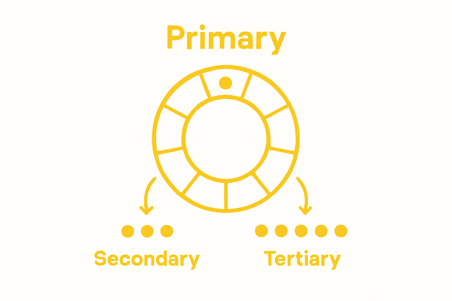
The color wheel serves as the primary visual tool in color theory, organizing colors in a circular format that reveals their intrinsic relationships. This essential diagram typically includes:
- Primary Colors: Red, blue, and yellow, which cannot be created by mixing other colors
- Secondary Colors: Green, orange, and purple, formed by mixing two primary colors
- Tertiary Colors: Created by mixing a primary and adjacent secondary color
According to the Defense Information School, understanding these color classifications helps artists and crafters make deliberate color selection choices that create visual harmony and aesthetic appeal.
Color Properties and Emotional Resonance
Color theory extends beyond simple categorization, exploring how colors possess intrinsic properties that influence perception and emotional response. These properties include:
- Hue: The pure color itself
- Saturation: The intensity or purity of a color
- Value: The lightness or darkness of a color
The University of Kentucky’s College of Communication & Information emphasizes that these properties determine how colors interact and communicate visual narratives. In crochet, understanding these nuanced color characteristics allows crafters to create pieces that not only look beautiful but also convey specific moods and aesthetic intentions.
This table organizes and defines the basic properties of color discussed in the article, providing a reference for how each property contributes to the emotional and visual impact in crochet.
| Color Property | Definition | Impact on Crochet Projects |
|---|---|---|
| Hue | The pure color itself | Sets the overall mood and style |
| Saturation | The intensity or purity of a color | Adds vibrancy or subtlety |
| Value | The lightness or darkness of a color | Influences depth, contrast, and highlight effects |
Why Color Choices Matter in Crochet Projects
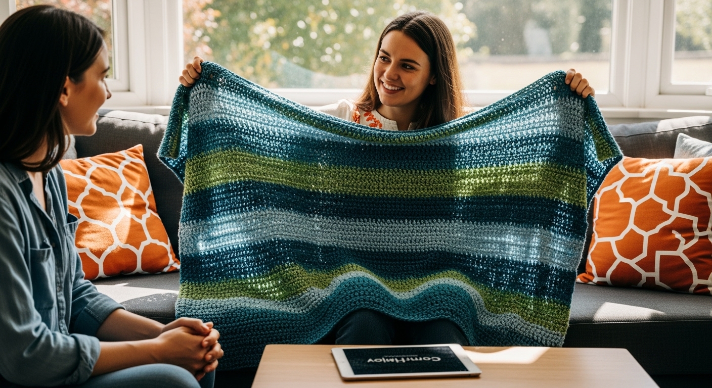
Color selection transcends mere aesthetic preference in crochet. It represents a powerful communication tool that transforms yarn and stitches into meaningful artistic expressions. Whether crafting a cozy blanket, intricate garment, or decorative accessory, color choices significantly impact the emotional resonance and visual narrative of the final piece. Explore stunning yarn color combinations to elevate your crochet projects.
Emotional Impact of Color Selection
Colors possess an extraordinary ability to evoke emotions and communicate complex feelings without words. In crochet, the strategic use of color can transform a simple project into a deeply personal narrative. Different color palettes can create distinct moods:
- Warm Colors: Evoke feelings of energy, passion, and comfort
- Cool Colors: Suggest calmness, serenity, and introspection
- Neutral Tones: Provide sophistication and timeless elegance
According to research from the Digital Crochet study, understanding color psychology enables crafters to design pieces that resonate on an emotional level, turning each project into a nuanced form of visual storytelling.
Visual Harmony and Design Complexity
Color choices in crochet extend beyond emotional expression to influence the perceived complexity and visual structure of a project. Strategic color selection can:
- Highlight intricate stitch patterns
- Create depth and dimension
- Direct the viewer’s visual attention
- Enhance the overall design coherence
Skillful color coordination allows crafters to transform simple patterns into visually compelling artworks, where each color interaction tells a unique story of creativity and intentional design.
How Color Combinations Affect Perception in Crochet
Color combinations represent a sophisticated visual language that dramatically influences how viewers perceive and interpret crochet projects. Beyond simple aesthetic choices, strategic color pairings can create optical illusions, manipulate spatial perception, and communicate complex emotional narratives. Learn essential crochet techniques to complement your color theory understanding.
Optical Dynamics of Color Interaction
Colors do not exist in isolation but interact dynamically when placed adjacent to one another. These interactions can produce remarkable perceptual effects that transform the visual experience of a crochet piece. Key optical phenomena include:
- Color Vibration: When complementary or high-contrast colors are placed next to each other, they appear to “vibrate” or shimmer
- Simultaneous Contrast: Colors appear to change when surrounded by different hues
- Color Temperature Shifts: Warm and cool colors create visual depth and movement
According to research from the Ohio State University’s color theory resources, understanding these interactions allows crafters to manipulate visual perception intentionally.
Spatial Perception and Color Psychology
Color combinations profoundly influence how viewers perceive space, depth, and emotional resonance in crochet projects. Specific color strategies can:
- Create illusions of depth and dimensionality
- Enhance or minimize specific design elements
- Communicate subtle emotional undertones
- Guide the viewer’s visual journey across the piece
Masterful color selection transforms crochet from a simple craft into a nuanced form of visual communication, where each color choice becomes an intentional storytelling element.
Key Concepts of Color Harmony in Crochet
Color harmony represents a sophisticated approach to creating visually pleasing and balanced color compositions in crochet. It goes beyond random color selection, involving strategic principles that transform yarn selections into intentional artistic expressions. Explore advanced crochet color techniques to elevate your crafting skills.
Fundamental Color Harmony Principles
Color harmony involves understanding how different colors interact and complement each other. Crafters can leverage several established color harmony strategies to create visually compelling projects:
- Complementary Harmony: Using colors directly opposite each other on the color wheel
- Analogous Harmony: Selecting colors adjacent to each other on the color wheel
- Monochromatic Harmony: Utilizing different shades and tints of a single color
According to research from Jane Howorth’s comprehensive crochet color guide, these strategies provide crafters with structured approaches to creating aesthetically pleasing color combinations.
Balancing Color Intensity and Contrast
Successful color harmony in crochet requires careful consideration of color intensity and contrast. Skilled crafters understand how to:
- Manage color saturation levels
- Create visual interest through strategic contrast
- Use neutral colors to provide visual breathing space
- Balance bold and subtle color selections
By understanding these nuanced principles, crochet artists can transform simple yarn selections into sophisticated visual narratives that engage and delight viewers.
Below is a comparison table summarizing the three main color harmony strategies discussed, helping readers quickly understand how each approach works for crochet design.
| Harmony Strategy | Description | Visual Effect in Crochet |
|---|---|---|
| Complementary | Uses colors directly opposite each other on the color wheel | High contrast, vibrant, makes patterns and stitches stand out |
| Analogous | Selects colors adjacent to each other on the color wheel | Subtle transitions, cohesive and calming effect |
| Monochromatic | Utilizes different shades and tints of a single color | Sophisticated, unified, highlights texture over color variation |
Practical Applications of Color Theory in Crochet Creations
Color theory transforms crochet from a simple craft into a nuanced art form, enabling creators to communicate complex visual narratives through strategic color selection. By understanding and applying sophisticated color principles, crafters can elevate their projects from basic handmade items to sophisticated artistic expressions. Learn advanced crochet edge techniques to complement your color theory skills.
Strategic Color Placement in Crochet Designs
Masterful color theory application goes beyond selecting pleasing colors. Advanced crochet artists use color placement as a deliberate technique to:
- Highlight intricate stitch patterns
- Create visual depth and dimensionality
- Guide the viewer’s eye across the design
- Emphasize or minimize specific project elements
According to research from the University of Wyoming’s 4-H program, understanding color placement requires careful consideration of each yarn’s visual weight and interaction.
Emotional Storytelling Through Color Selection
Color combinations in crochet serve as a powerful communication tool, allowing crafters to convey complex emotional landscapes without words. Different color strategies can evoke specific feelings and experiences:
- Warm Color Palettes: Communicate comfort, energy, and passion
- Cool Color Combinations: Suggest tranquility, reflection, and calm
- Gradient Color Transitions: Create a sense of movement and transformation
By thoughtfully selecting and arranging colors, crochet artists transform their work into personal narratives that resonate deeply with viewers.
Bring Color Theory to Life with Premium Yarn from CRAFTISS
Choosing the perfect color combination for your crochet project can feel overwhelming. You want every stitch to reflect harmony, emotion, and intentional design, just as you learned in the article. At CRAFTISS, we understand that mastering color theory starts with the right materials. Our Yarn collection offers a vibrant range of shades, intensities, and textures so you can explore every creative idea without limits.
.png)
Ready to elevate your next masterpiece? Visit CRAFTISS and discover the yarn that brings your color vision to reality. Shop now and experience how the right yarn makes color theory not only accessible but exciting for any crochet enthusiast.
Frequently Asked Questions
What is color theory and how does it apply to crochet?
Color theory is a framework that explores how colors interact and evoke emotions. In crochet, understanding color theory helps crafters make intentional color choices that enhance visual appeal and expressiveness.
How do primary, secondary, and tertiary colors impact my crochet projects?
Primary colors (red, blue, yellow) are the building blocks of all colors, while secondary colors are formed by mixing two primary colors. Tertiary colors result from mixing a primary color with a secondary color. Knowing these classifications helps create harmonious color combinations in crochet designs.
What strategies can I use to achieve color harmony in my crochet work?
To achieve color harmony, you can use complementary (opposite colors on the wheel), analogous (next to each other), or monochromatic (different shades of one color) color schemes. These strategies enhance the visual impact of your crochet pieces.
How can color choices affect the emotional response to a crochet project?
Color choices can evoke specific emotions; for example, warm colors may evoke energy and passion, while cool colors can suggest calmness and tranquility. Understanding this can help you design pieces that resonate emotionally with viewers.
Recommended
- 8 Inspiring Crochet Color Combinations for Your Projects – CRAFTISS
- 7 Stunning Yarn Color Combinations You Must Try – CRAFTISS
- How to crochet with yarn: your ultimate beginner’s guide to mastering – CRAFTISS
- How to Choose Yarn for Your Next Craft Project – CRAFTISS


